Redesigning Aife
Hey, so it's been a while since I did or said anything with/about Beeknighted. After the launch of the demo disc, I updated the game feverishly for a couple weeks, but I got into some dire financial straits and was looking for more work for a long while. I also took a break from Beeknighted to work on Star Crucible, which was only intended to be a one-month quick little project for a game jam that has spiraled out of control. It's still in the back pocket but I need to let it simmer for a while I refine some of its ideas.
I'm now working on a third project, this time something I'm telling myself I'll actually get done in a short time (I know, I know). But I just couldn't stop thinking about things I wanted to do with Beeknighted. I've been writing characters, chunks of the main quest, designing weapons and items, all just on paper because I haven't really had a chance to properly work on it for a while. But I thought I shouldn't set aside both Beeknighted and Star Crucible without at least dropping a crumb or two, so I've been working on the redesign of Aife, the bee.

First off, why the redesign?
The bee was the first full 3D model I had ever created, textured, and animated. Period. It had...a lot of problems and beginner mistakes. And I didn't just wake up one day and bust out a perfect model of what was in my head. Version 1.0 of the bee was...quite frankly horrifying.
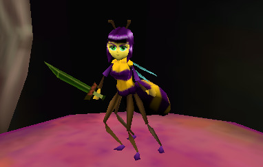
Yeah, it...it was bad. It was made in 3 days for a game jam using youtube tutorials for a guide (which was not the fault of the tutorials at all, simply user error). When I decided to develop the game further, I set about retexturing the model, thinking I could save the geometry. I really just cleaned up the face and body.
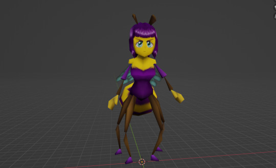
But this didn't fix the underlying faults with the model. The rig was just plain bad. There were weird issues with weights where if you bent the character too far forward the head would shrink, the hair couldn't animate well, there are no shoulder bones so no shoulder movement, lots of issues all around. Those weren't easily fixed when I already had made around 40 animations using the rig.
There were also issues with the body geometry. The arms/hands/legs/feet/wings were all fine, but the head, thorax, and abdomen, to get technical, were all imperfect. There's weird shading issues you can see on the body that are a result of bad topology. A failure to properly triangulate the abdomen caused it to look weird at some angles. And the head is just poorly modeled overall. It uses a lot more triangles than necessary and doesn't achieve the intended design goal. Heads are hard, faces even more so. She doesn't even have a nose.
Even if you can excuse the mediocre rigging and amateur geometry, you can't excuse the biggest problem of all: my crime against video game collision shapes:
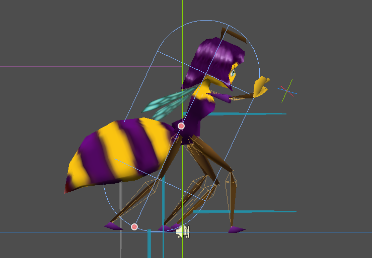
I shouldn't even be allowed to touch a computer after this atrocity.
It was really important to me that the collision represent the shape of the character for the combat to feel precise. But this disaster meant platforming is all over the place. Not to mention if the character gets horizontally wedged between two walls, there's no escape because the character can't turn around. I had thought "Spyro did it [an oddly shaped character], so can I" but I am not a seasoned Insomniac developer. Even so, I don't know how I was allowed to sneak in this egregious sin against video games for so long.
So in short, these changes had been a long time coming.
The goals of the redesign:
- First and foremost, the bee had to stand more upright (or else more horizontal, not diagonal) so that I could use a regular upright collision capsule. At the same time, I wanted to maintain as many bee elements as possible.
- The abdomen had to be a bit smaller and more out of the way so the player could always see where the feet were landing for platforming purposes. This was a bigger problem than you'd think.
- The character had to appear older but still look small. This was simply a mistake in the old design that the face looked too young by the nature of me struggling to draw faces + the bad geometry. The bangs were meant to hang down more but the model didn't allow for it.
- Details needed to be crisper, bolder, and chunkier. When I played the demo on my CRT, I noticed the thinner points of limbs threatened to get lost on screen. N64 characters tend to be noticeably more chunky to compensate.
My inspirations for the initial character came from a range of sources. Obviously with the game being inspired by N64 graphics, I picked inspirational references from contemporary characters, as well as characters from media that had been created/released in the run-up to the N64 that might have inspired later works. I wanted the bee to look like a mix between a silent JRPG protagonist (or, y'know, Link wouldn't be a bad pick) and classic fantasy/horror anime female protagonists (the ones that all have that same long hairstyle, black/dark hair, poofy bangs in the front).
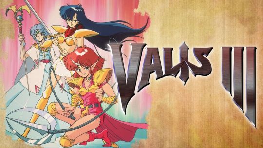
My moodboard included Yuuko from Valis, Utena from Revolutionary Girl Utena, Popful Mail, Aika and Fina from Skies of Arcadia, a handful of leading ladies from late 80s/early 90s horror OVAs (like the kind Madhouse was putting out at the time, but usually worse), and some Fire Emblem characters.
The N64 doesn't really have a lot of 3D "anime" characters to use for references. You've got the oft-maligned Quest 64, and some of the more anime-inspired characters from the Zelda games and a handful from Megaman 64, though Megaman's art style and way of 3D modelling is fairly unique in its own right.
I suppose I should emphasize that while the main character and some of the side characters are anime-inspired, the point was not to make an anime game per se. I chose the look because of its potential to create expressive and amusing faces because I wanted the bee to have as much character as, say, Link from Wind Waker, who is constantly emoting about anything and everything.
The New Version
Aife's new model sports a totally remade head and body. While using the old limbs, I thickened them up a bit for visibility while still trying to maintain that bug-like spindliness. The abdomen is slightly smaller and the geometry is simplified. I simply didn't need that many triangles. She stands more upright, and the head is in a more natural place above the shoulders, and the human-ish proportions are better. The redone body uses vertex colors, rather than textures, but leaves the option open to texture new costumes. I also redesigned the bangs to drape lower on the face but not get in the way of the expression. The old bangs made the character look too childish, imo. All of the textures have been redrawn, simplified, and cleaned up. She now has a nose.
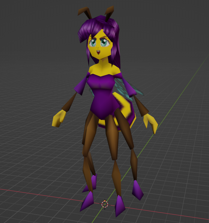
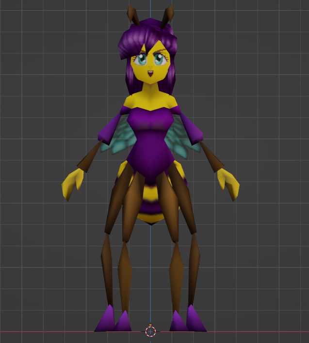
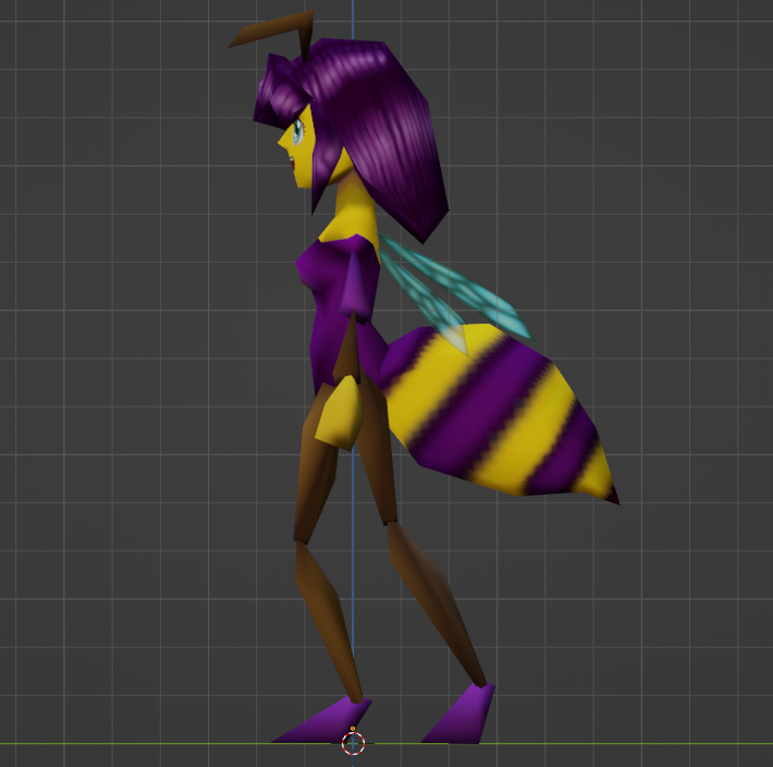
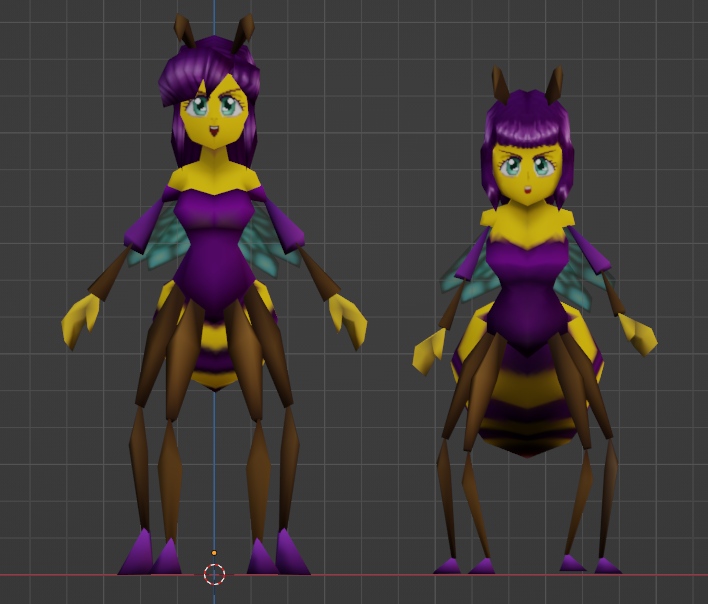
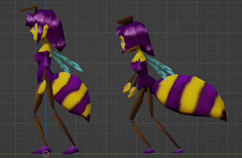
Despite all of the improvements and added details, the model weighs in at 100 fewer triangles than the old model, for a total of 672 tris.
I'm much more confident that this new Aife will be better suited to the highly animated gameplay required of her, and can't wait to dive into the rigging/animating process. But that's all for now!
Get Beeknighted Demo (32-Bit Game Jam)
Beeknighted Demo (32-Bit Game Jam)
Short N64-inspired action game made for the 32bit game jam 2021
| Status | In development |
| Author | MicrotonalMatt |
| Genre | Platformer |
| Tags | 3D, 3D Platformer, Action-Adventure, Action RPG, Fantasy, Female Protagonist, Low-poly, n64, Nintendo 64, PSX (PlayStation) |
More posts
- Demo v.3.7 released!Sep 12, 2022
- Beeknighted v.3.5 released!Aug 31, 2022
- Antfort Progress Update Towards v.2.3Aug 10, 2022
- Version 2.2 Update fixes and changes + LinuxJun 19, 2022
- 2.1 Update, Preview of Future UpdatesJun 14, 2022
- Demo Progress Update 4/14Apr 15, 2022
- 1.5 Update releasedJan 07, 2022
- 1.4 Update releasedJan 03, 2022
- 1.3 Update (Bug Fixes) has been releasedDec 20, 2021
Leave a comment
Log in with itch.io to leave a comment.